 Claude Monet — Fishing Boats
What's new in CloudMonet
A running log of what shipped — redesigns, new controls, and the reliability fixes you never see until they're gone.
The headline feature of this stretch: real control over how an operator's screen is organized during a show.
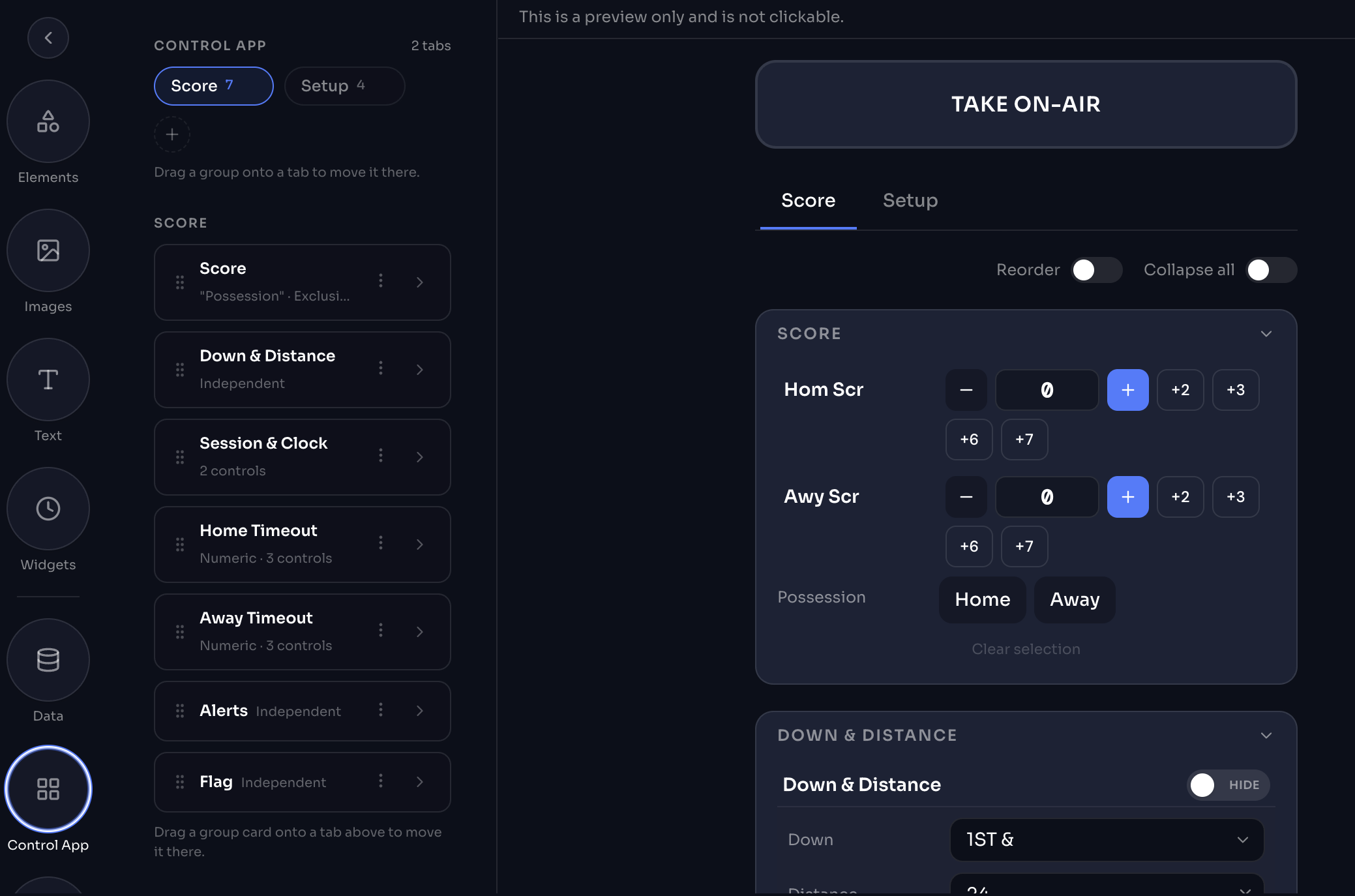
Groups and tabs, organized by you.
Operator controls can now be organized into groups and tabs using the new Control App Designer, instead of one long scrolling list. Drag a group of controls onto a tab to move it there, reorder groups, or collapse them all at once — build a layout that matches how your operator actually runs the show, scores on one tab and setup on another. Along the way, we also simplified the UX on a number of individual controls, so the panel itself feels less complex to work in. Open any graphic and look for Control App in the left-hand menu to try it, or see it live in the Football Scorebug demo.
The first template rebuilt on top of the new Control App Designer.
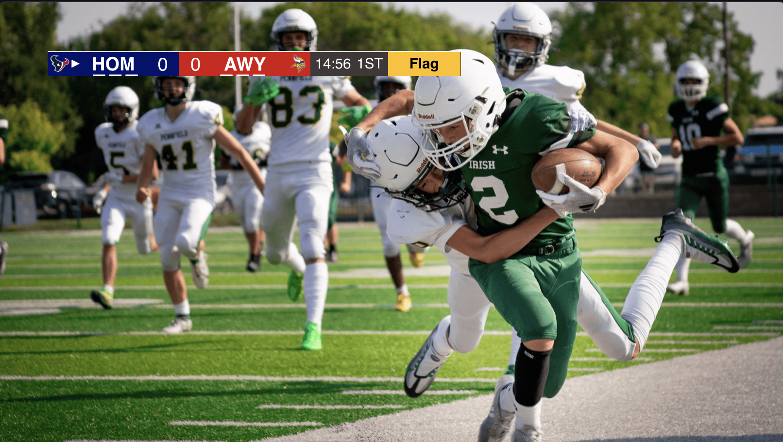
Flag support, and a move to the new Control App.
The Football Scorebug now supports a Flag indicator, so the operator can call a penalty on air the moment it happens, the same way the template already handles scores and timeouts. The template has also been migrated onto the new Control App Designer, with controls grouped and tabbed instead of stacked in one long list — making it noticeably easier to operate during a live game. — try the demo here.
Small changes to how you move through the app day to day.
The bugs you'd hit setting up a show or customizing a template, not running one.
Build deeper, and let visitors keep exploring.
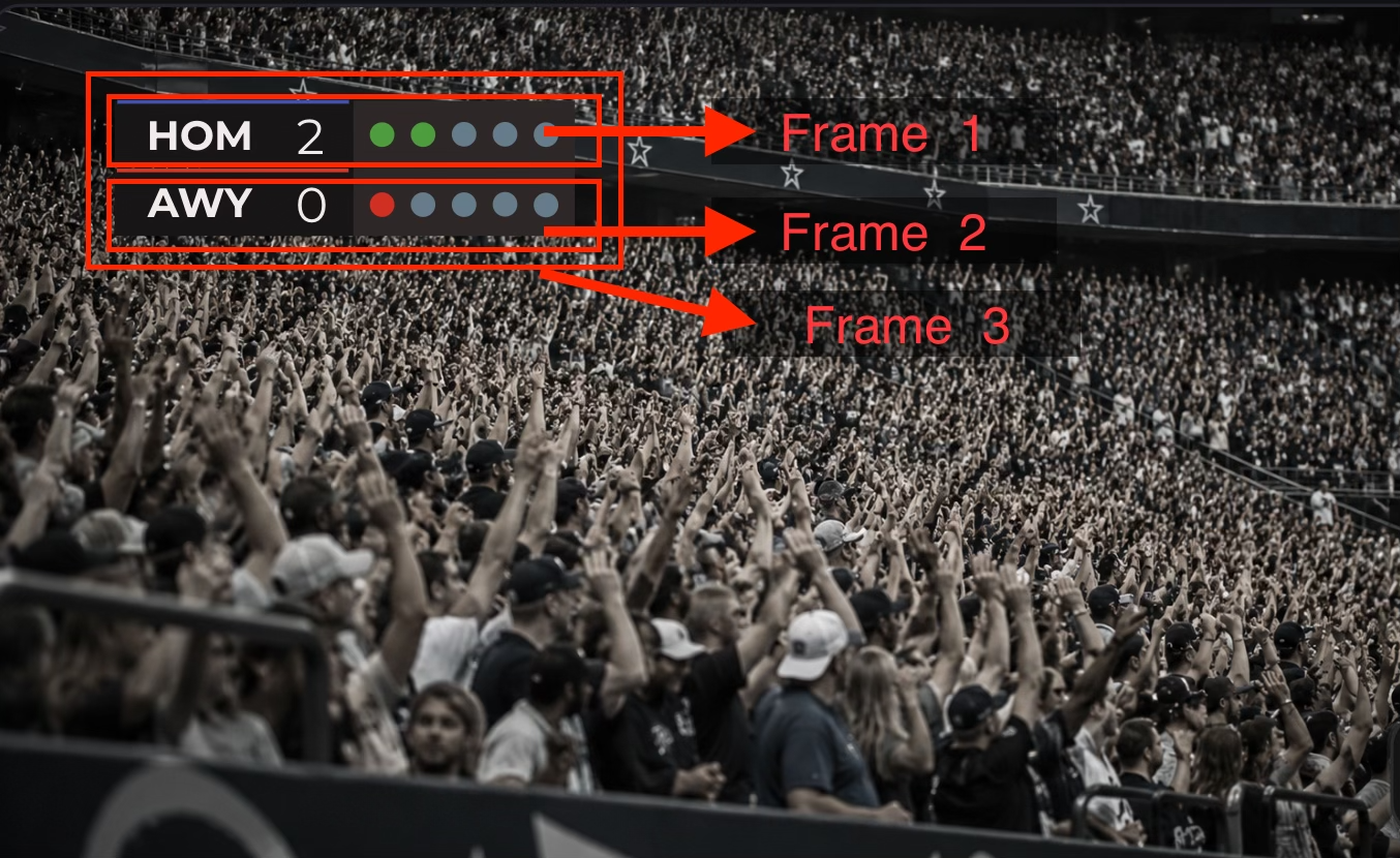
Composite Frames, nested two levels deep.
A frame can now hold another frame inside it, up to two levels deep — instead of every object living flat on one canvas. Take a two-team scorebug: Team A's abbreviation, back plate, score, and penalty markers can live in one frame, Team B's matching set in a second, and both wrapped inside a third outer frame. Each inner frame moves, scales, and animates as its own unit, so you can time Team A's entrance separately from Team B's, or resize the whole scorebug and have both sides scale together — better-organized composition, and more precise animation control. — see it in the demo here.
Browse templates from inside a demo.
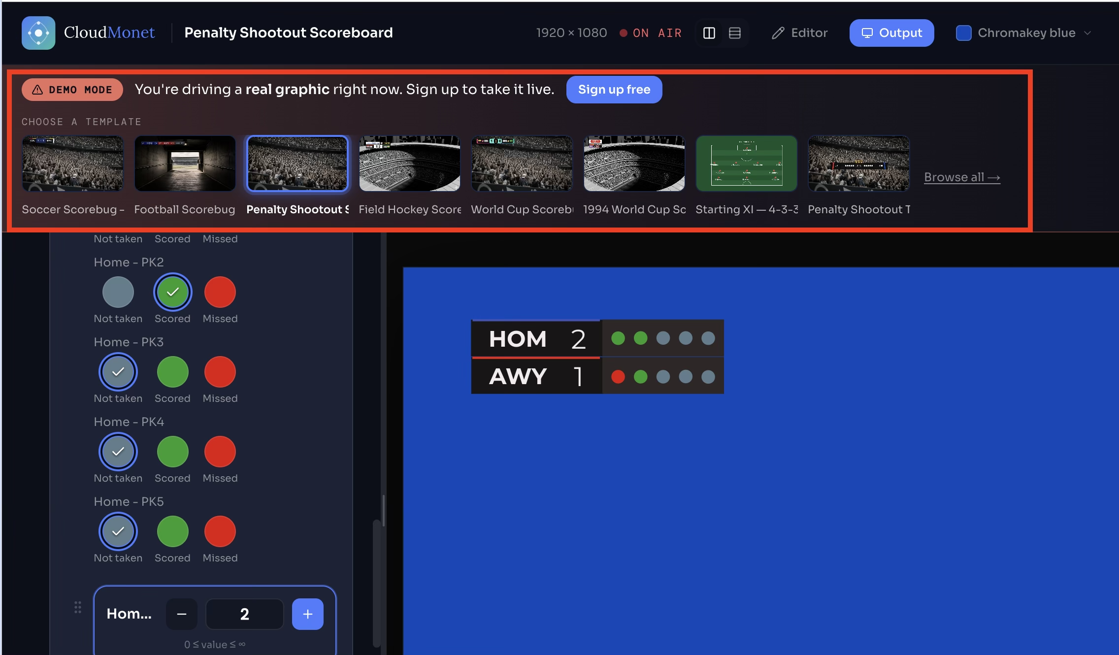
The demo Control app now shows a template carousel, so anyone trying out a demo can browse other templates without leaving the page — try it here.
Nested frames were brand new this cycle, so most of the week went into hardening them the moment we found the edge cases.
A new scorebug joins the gallery.
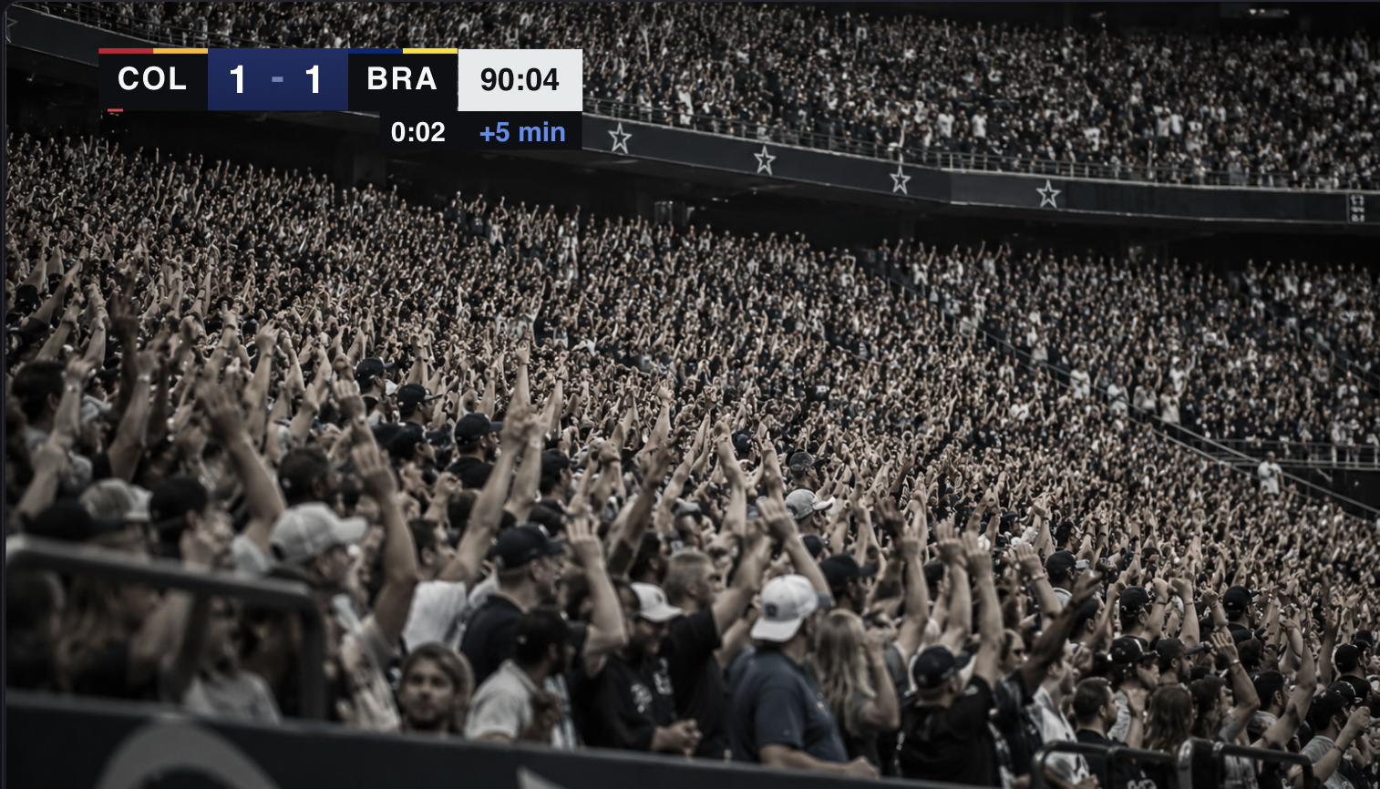
Soccer Scorebug, added.
A four-frame broadcast scorebug for soccer coverage: operator-entered team codes and scores with kit-color identity bars, a separate operator-run match clock and stoppage/added-time timer, up to four red-card indicators per side, and a full-width GOAL celebration the operator triggers live the instant it happens.
Small additions that change how a graphic looks and behaves on air.
The bugs you'd hit setting up a show, not running one.
A pass across the site aimed at one thing: how fast a page feels the first time it loads.
Our template gallery keeps expanding its sport coverage.
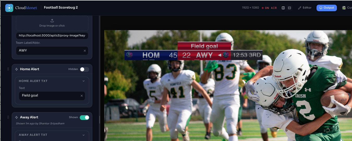
American football templates, added.
A full scorebug for American football, built the way a broadcast actually runs one. Home and away plates carry bindable team labels, badges, and scores, with timeout dots and a possession triangle that fade in per side, plus a merged quarter/game-clock module — the whole bar scales open on entrance instead of cutting in. A down & distance pill and two color-matched alert banners (ready out of the box for "Field goal") sit alongside it, so the operator can slide them in the moment the play calls for it — check it out here.
A handful of controls designers have been asking for.
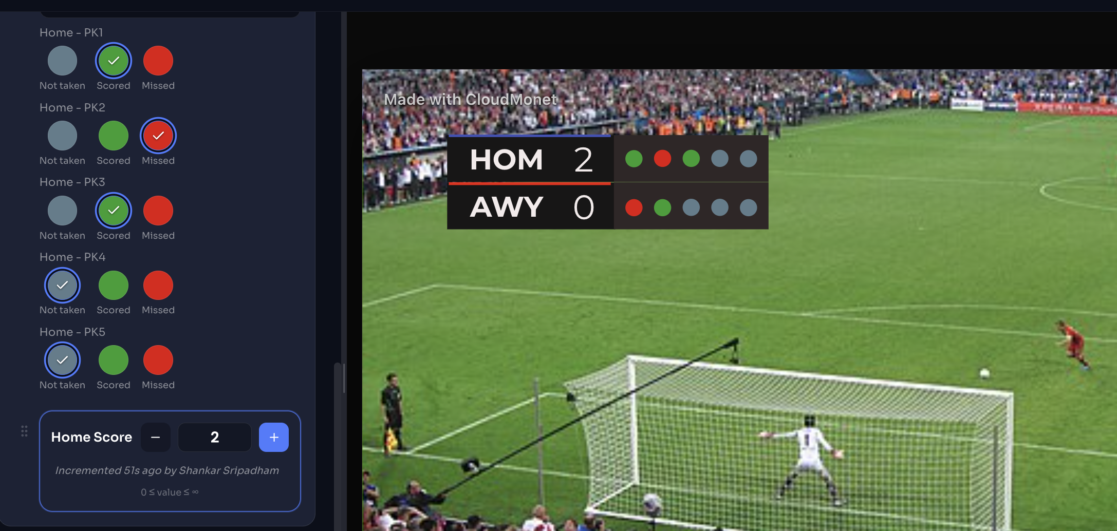
Lock operators to a palette.
Restrict an object's fill color to a fixed set of swatches. Perfect for a penalty-kick tracker where a color needs to mean something: grey for not taken, green for scored, red for missed — and nothing else the operator can pick.
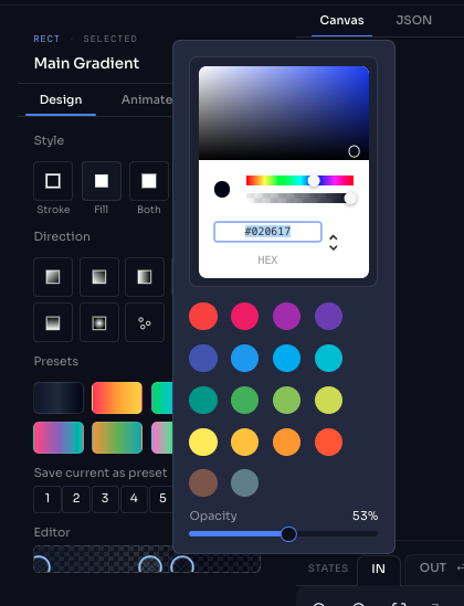
Gradients get per-stop opacity.
Every stop in a gradient fill now carries its own alpha value, so fades to transparent are finally a first-class option. Use it for soft vignettes and fades, or stack it with a metallic gradient for a brushed-steel scorecard finish — see it in action on the football scorebug template — check it out here.
The single biggest thing we fixed this week: what happens to your graphic when the control tab loses focus, gets backgrounded, or comes back from sleep. It should always come back exactly as you left it — now it does.
The small stuff that trips you up while you're building a graphic, not while it's live. Say you're duplicating a widget to build out a second team's card, or fixing a typo in a dropdown two minutes before air — these are the bugs that used to get in your way.
Plus three smaller fixes to dropdown option entry, widget duplication, and animation curve dragging.
The two screens you open first, every day, now pull their weight.
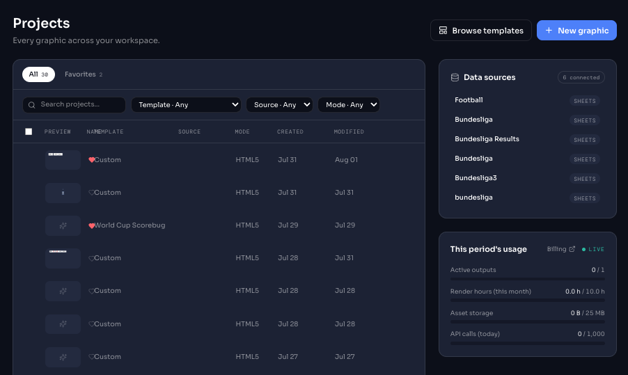
Projects, now a real table.
Every graphic across your workspace, in one dense, filterable list. Search by name, filter by template, source, or mode, and scan created/modified dates at a glance — no more hunting through cards to find the scorebug you built last Tuesday.
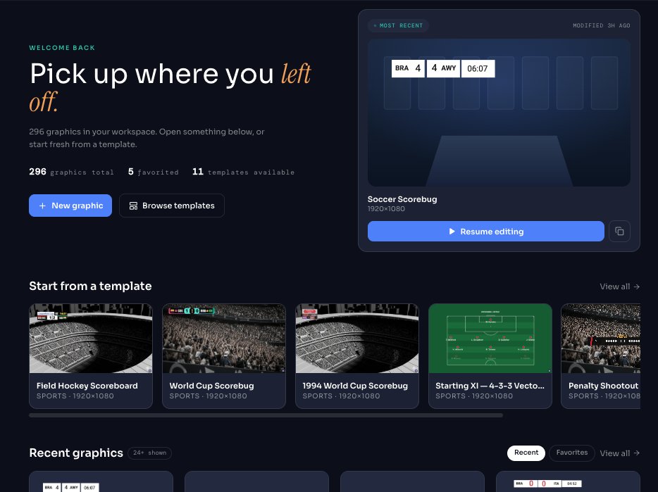
Home picks up where you left off.
Your workspace landing page now opens straight into what matters: recent graphics, a template rail to start fast, and clearer stats up top. It's the same five-second decision every morning — now it takes two.
Timer, Countdown, Clock, Ticker/Scroller, and Counter all got the same minimalist treatment — less scrolling, more finding the control you need mid-show.
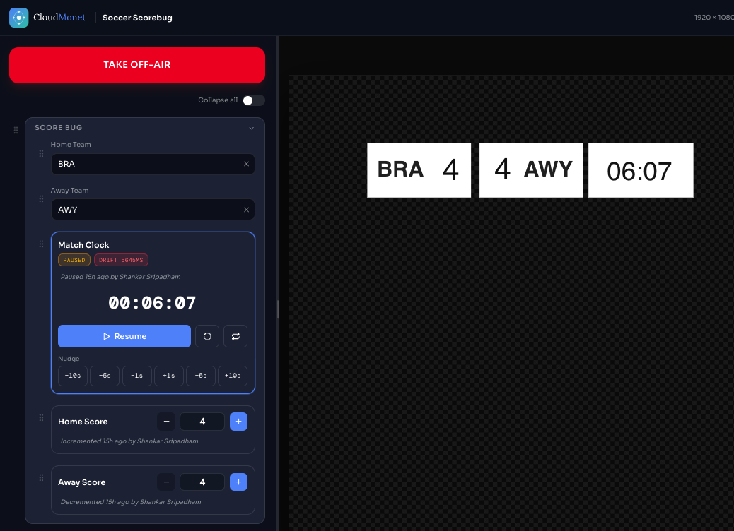
One Control Group, any object.
Operator-facing controls for Clock, Counter, Timer, Countdown, and Ticker/Scroller now live under a single, consistent Control Group tag — and that same grouping now extends to text, shape, and image objects too. Group anything you want an operator to touch mid-show, and the control app reads it the same way every time. New objects also get sensible default names automatically.
The unglamorous stuff — the bugs you'd hit mid-broadcast and never mention, because you were too busy fixing it live. We found them anyway.