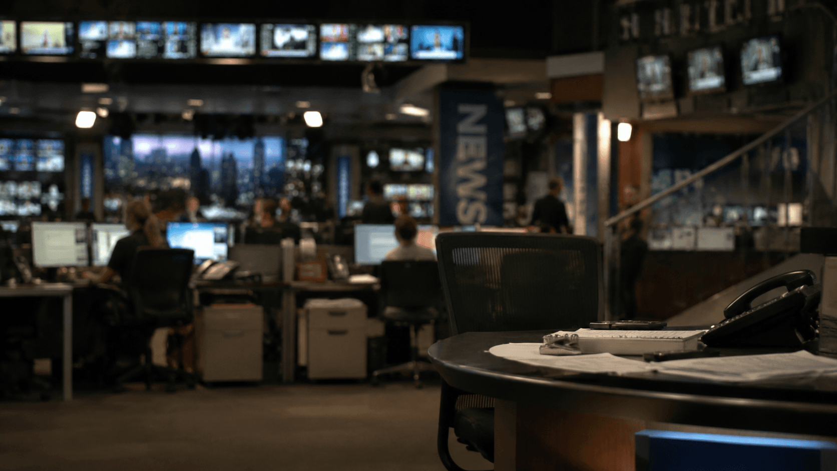
Lower Third — Diagonal Accent
Near-black bar with a stacked three-layer parallelogram accent in blue (#2f4bff) to violet (#7c3aed), gradient topline rule, slide-in name, and gradient fade title band.
Why near-black instead of solid black
The bar is near-black at 92% opacity rather than solid black — this preserves a trace of the video below at the edge, avoiding the hard-cut look of a fully opaque bar against the picture.
Three-layer parallelogram depth stack
Three parallelogram layers at offsets 48 / 72 / 92px create a depth stack that reads as a single energetic diagonal motif. The back layer uses a 28% opacity blue wash, the mid layer carries a top-to-bottom blue→violet gradient, and the front layer is solid electric blue (#2f4bff). The stagger is a deliberate forced-perspective illusion — each layer is a distinct polygon, not a drop shadow or blur.
Gradient topline as brand signal
The topline is a 3px gradient rule running blue→violet→cyan across the full 1920px width. It serves as both a content separator and a brand signal — the same palette that drives the parallelogram accent appears here in a single compressed stroke.
Name tracking and weight
Name text is set in Arial 700 at 38px with 80 charSpacing. Tracking tightened from default keeps the name compact without feeling cramped — important when the name strap competes with the parallelogram accent for horizontal attention.
Gradient title band avoids a hard box edge
The title sits on a gradient rect (blue→violet→transparent) that fades right. This avoids a hard box edge against the bar background and gives the title line its own identity without needing a separate colour. Title text is #e8e8ff — a perceptible but subtle lavender tint distinguishes it from the name white without introducing a second hue family.
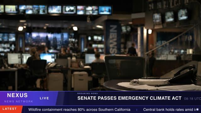
Use this template for name straps on interviews, panel guests, reporters, and contributors — any situation where the person on screen needs to be identified clearly and quickly. The diagonal accent is network-energy without being aggressive; it reads as contemporary and premium without competing with the content. It is not suited to sports use (the colour palette has no team-colour flexibility in this build) or situations requiring a third line of text such as a location or social handle.
Ready to use this template?
Open it in the CloudMonet editor to customize and export.